
US Actors Company is a Murder Mystery Theatre company out of Dallas TX. With a recent turn over in ownership, the company was looking for a re-vamp in their logo design. With several other murder mystery and niche theatre storytelling companies, they really wanted to stand out while still holding true to company standards. I was approached by the owner and artistic director to create a modern murder mystery inspired logo that they could use on a variety of print and digital publications and marketing materials.
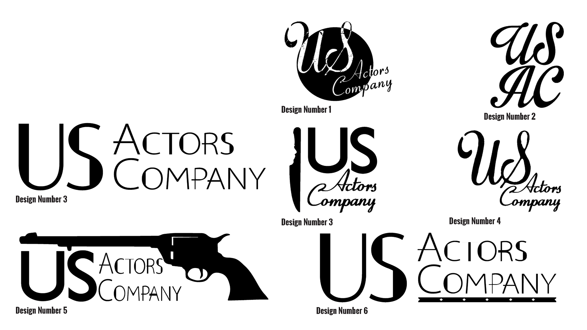
Concepts and Ideas.
While comparing the various other murder mystery companies in the area I realized where US Actors Company stood. They are developers of modern and classic style stories, very different from the western and police drama styles of their competitors. Although it might seem cliche to do so, I chose to follow a modern Film Noir style. Us Actors Company truly embodies this spirit. They are known for fun professionalism, which was a quality I aimed to include in their design. Below is a collection of beginning ideas, each had its own personality within the discussed Modern Film Noir sense.
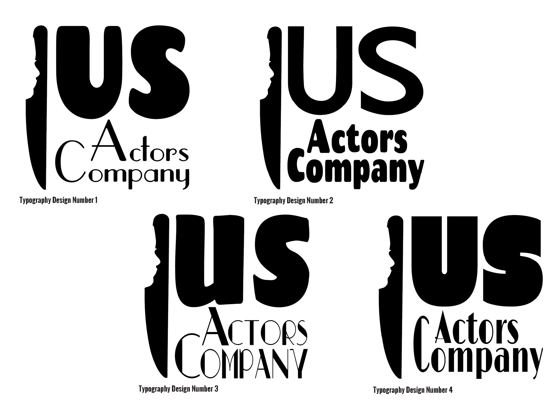
Developing the Typeography.
Next I worked to find the correct style of font. I was looking to pair a more modern and simple font, with a stylized 1940's font. Paired with the face in the knife handle, I was aiming to give the design a bit more information simply from looking at the logo. Below is four different typography choices, with the client choosing a mix between Design #3 and Design #4.
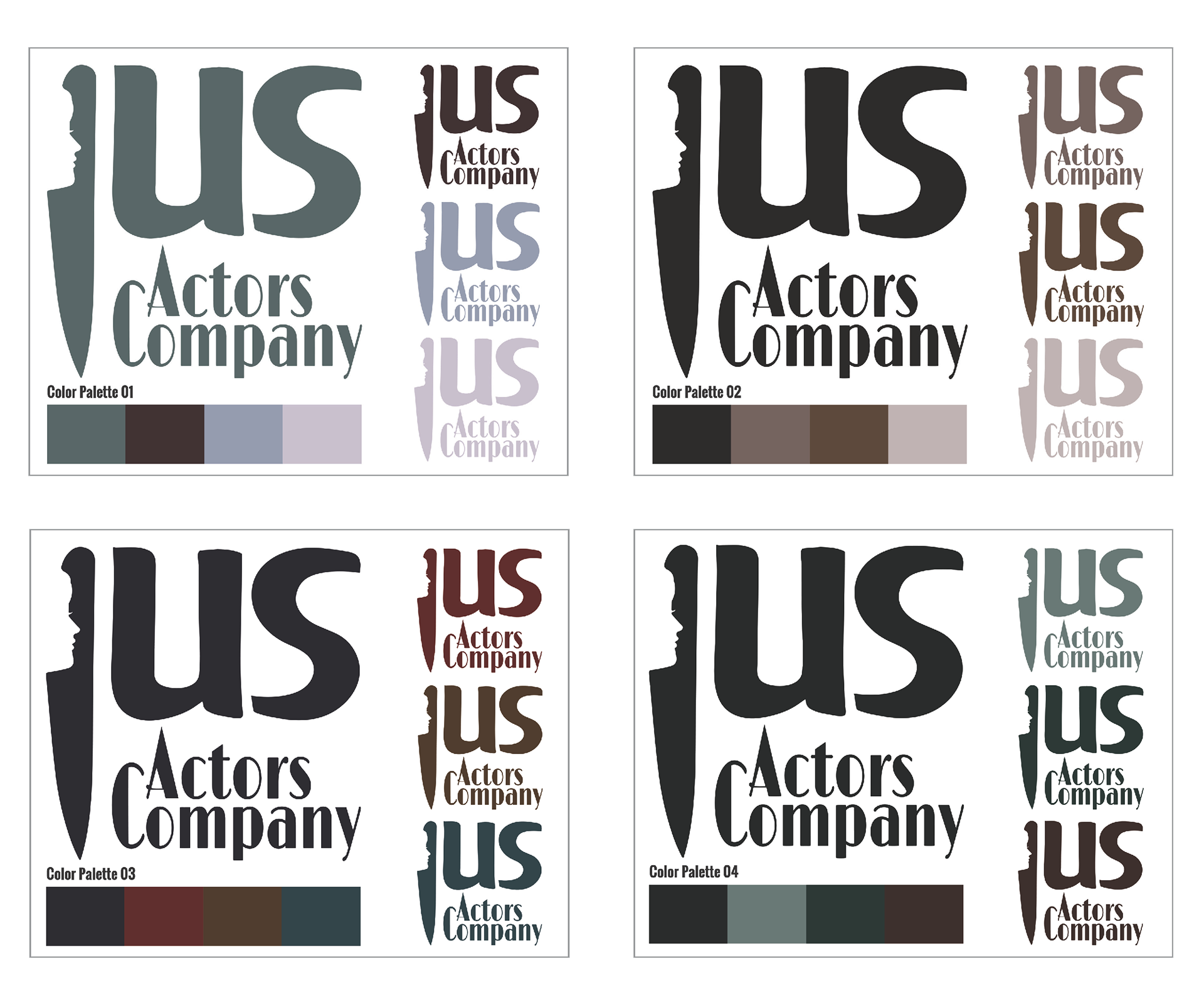
Developing the Logo with Color.
After working and re-working the design elements of the logo, it was time to choose colors. With the color palettes of the competitors speaking very traditionally to their theme, I too wanted to do this for US Actors Company. Each palette was a Film Noir Inspired four tone pallet. Ultimately we decided to push for a more colorful palette, but this was certainly the starting point.
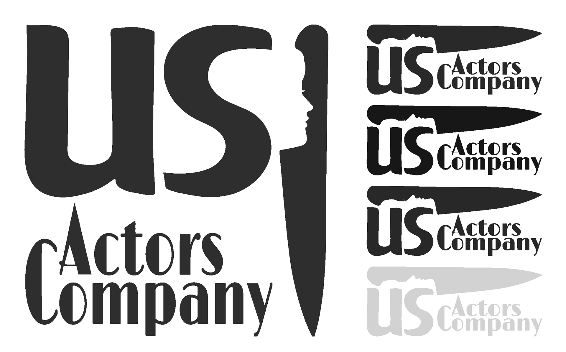
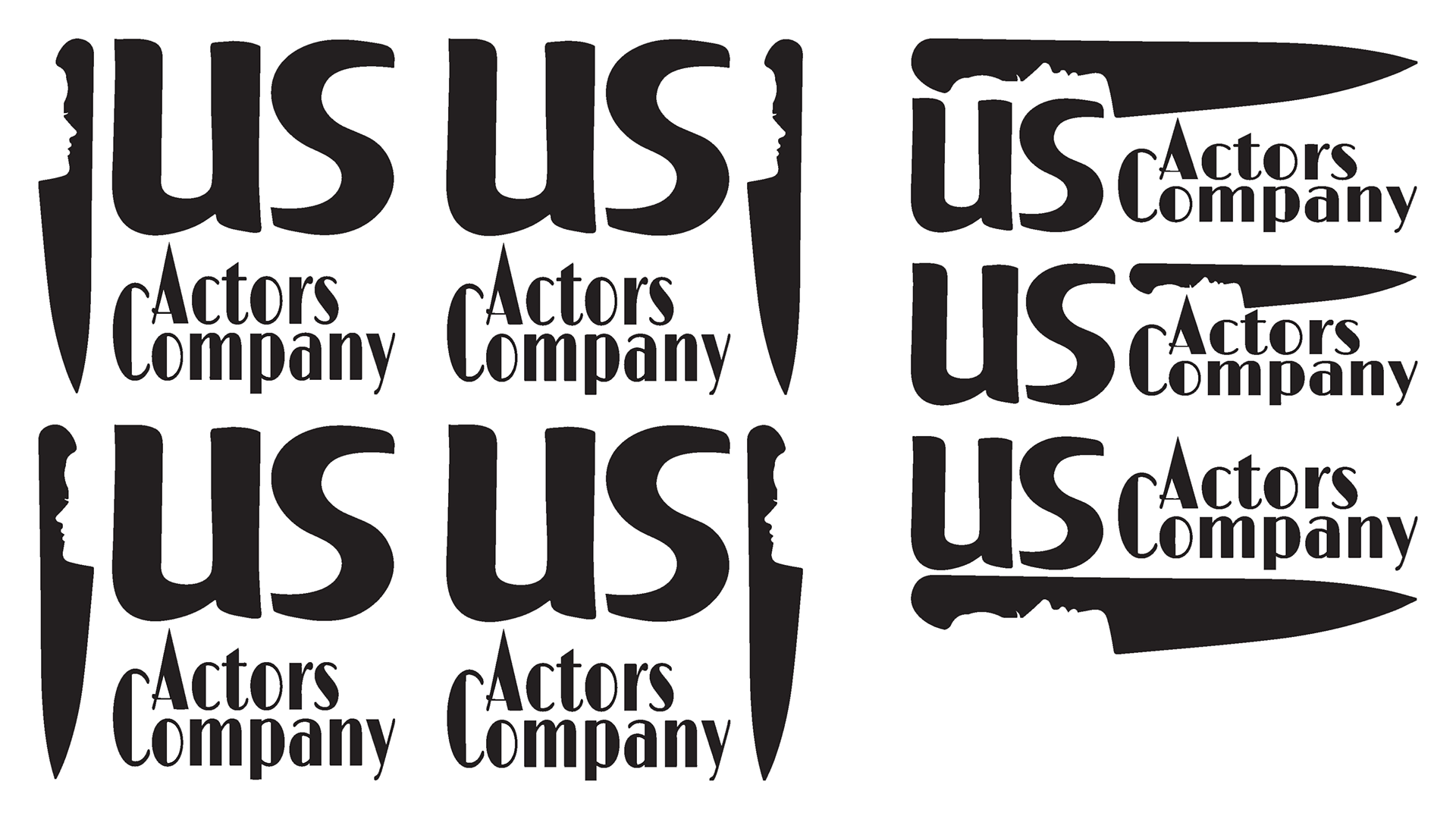
Finishing the Layout.
As I was also working on color I was also working on the layout. The design required me to develop a squre logo for digital profile pictures and more main stream uses, and a horizontal layout better suited for small placement and tight spaces. Below is the development of each.
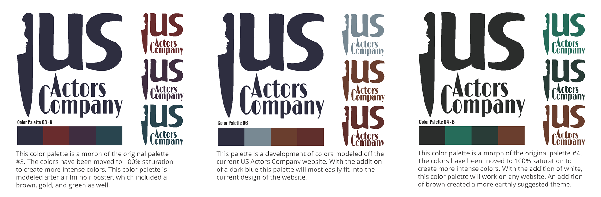
Finalizing the Colors.
The colors were finalize with a second round of palette development. Each one of these was based on an actual Film Noir Colored poster. The palette 3-B was chosen for it's brighter tones, and more modern feeling.
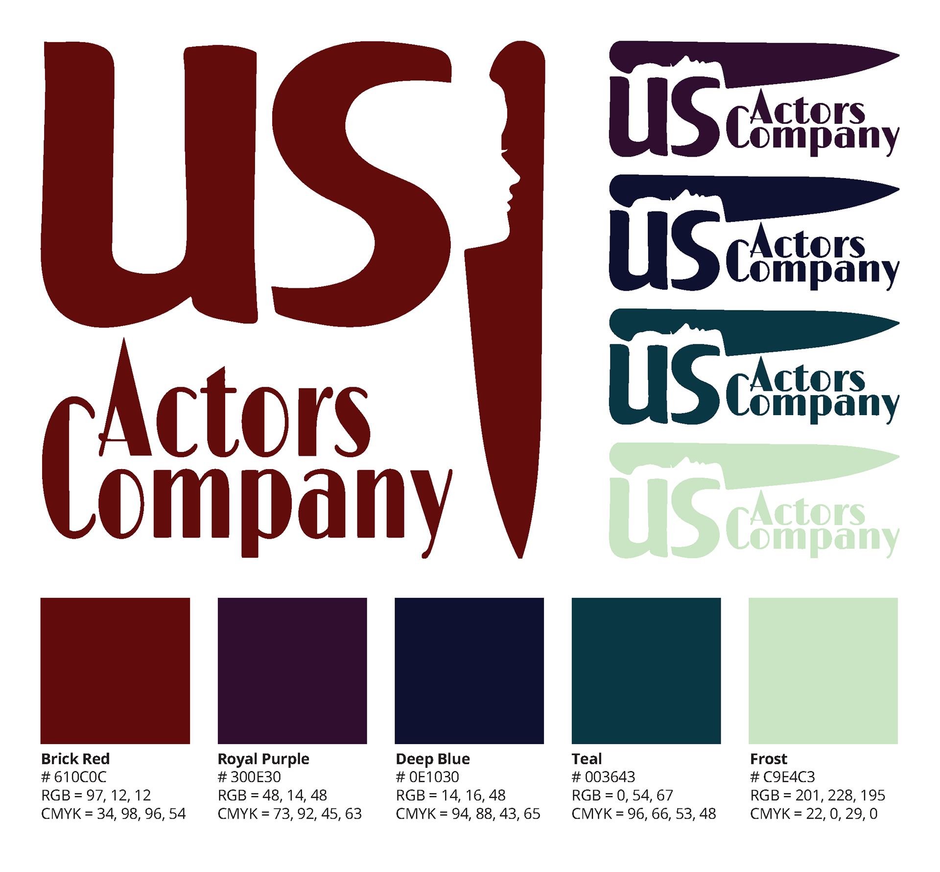
The Final Design.
The final design was each of these pieces put together in the puzzle. The layout, typeography, and color palette combined, create the US Actors Logo you see below. I also added an additional lighter color to the palette to allow for a more fuctional use on dark backgrounds. The US Actors Company intends to continue use of the color palette on other pieces of design material as well.